|
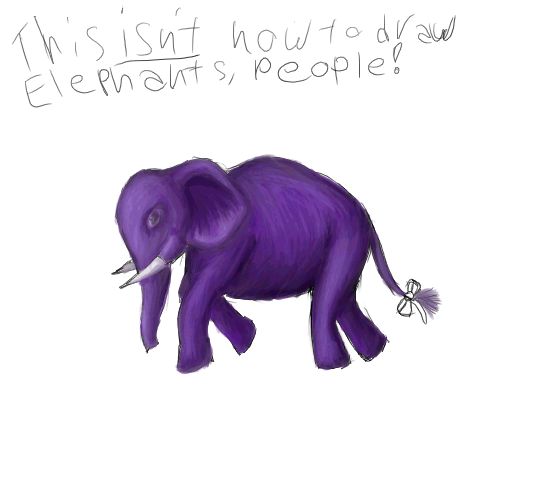
Derek the Purple Elephant.
If you've wondered about the origins of this peculiar purple pachyderm, wonder no longer. This is the original.

Welcome to OC...
For future reference, this tutorial and the below artwork were all done with openCanvas1.1 - b68. We don't need no stinkin' layers.
You want to paint in OC, so you probably already have something in mind. But for the sake of this, I am using... an elephant. And because this is on how to paint rather than how to get a charcoal/pencil effect, he's going to be purple. And because I don't want to continue typing "elephant" repeatedly, from now on he will be referred to as "Derek."
So, allow me to introduce you to your best friend for the tutorial.
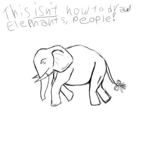
Derek the purple elephant.
Who can be downloaded here if you would like to use him as a test subject.
Oh shut up, this isn't how to draw elephants, people. If you want that, you're in the wrong tutorial.
One thing you should get familiar with is the "undo" key command. Ctrl+Z. Also the save command. Ctrl+S. Trust me on this one. If you do something on the picture that makes you go "hey, I like that" SAVE IT AT THAT MOMENT. Don't do anything else until you've saved. You'll regret it later if you don't take that advice. If you feel you want to experiment more, simply create a second copy save of your image. The reason you should save at the very second? Well, many things, your PC could crash and your work will be lost. The power could fail. But mainly, OC doesn't have a huge "undo" time frame. And You're best to save while you like it rather than screaming at OC to undo just one more step when you don't like it anymore. Saving while you like it means you can close the file on the bad changes, and reopen it back to the stage you still liked it at.
I usually save my sketch and painting as different files, so if I decide I want to scrap the whole painting and start over, my sketch won't be ruined. Maybe you're a person that's happy with your work first time, maybe not. But I do suggest saving the sketch as its own file before you get started. That done, let's move on.
First thing's first. Click the paint tool. Now you can fiddle around with the settings later on to get different effects, but for now this is just getting a basic grasp on the tool. So, the only setting we're going to touch here is the size. Since Derek isn't a large object, put it to about 5 pixels. You can make it smaller, about 3, if you're working the tighter areas. I also used the size 3 for the blending on this one, so after you lay the basic color down, you might want to switch over sizes as well.
But before we start on Derek, just scribble the paint brush around a bit and notice how it blends with the background. Lighten the pressure, then get more forceful, then lighten it again. See the difference in the blend with the background as you go? Remember how that feels. I often do a test scribble or two myself before I really get to work on things, to see how a certain color might blend, etc. It's all about the pressure, the scribble, the feather, the flow.
Now put the color to a deep purple. I find it useful to keep the color selector up at all times while I'm working. As with the brush/pen, etc. tool box, so just leave them where they are.
You'll find the paint tool wants to blend with the background color, which is fine, just let it. Scribble the paint brush back and forth a bit if you're working with a really dark color, this will work the color into the shade it should be. And remember OC recognizes pressure, so don't be shy about it when you're working with darker colors. If you do something that just looks wrong to you or you aren't fully comfortable with, just hit that undo command, that's what it's there for.
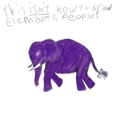
There, now Derek is all one color. But you'll notice with the slight lax in pressure from time to time, it gains a sort of texture. Which is just fine, in fact you want this to happen. This is similar to the different brush strokes an artist will end up with in traditional media. So let it come naturally, don't try to force it.
Now pick a darker shade of purple, in the same spectrum. Here I'm using a size 3 brush. Go into the areas that should be darker, like inside the ear, work up the color nice and dark with a bit of a scribble. Now lighten up your touch, and feather it. Light strokes outward from the darker color here. It'll give it a softer, more natural look, and you start to get some depth. Work with the flow and shape of what you're painting.

Remember, scribbling for the darker color workup is a more forceful pressure, like putting the tacks in when hanging a poster. The feathery strokes are light and made by just barely applying any pressure at all. More like the "barely there" of a feather running over your hands rather than the feeling of pushing the tack into the wall.
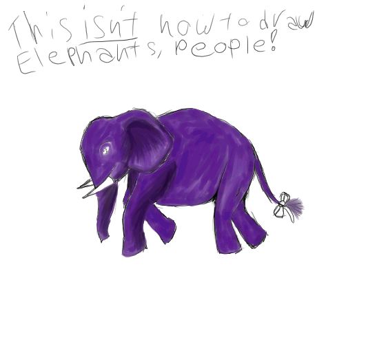
Using very light strokes will also help your colors blend. So if you want more shadow, blend from the darker parts. If you want it to blend lighter, stroke into the dark from the lighter bits. Do it lightly and it'll blend more than putting on new color from the brush. Lots of light back and forth strokes between the two colors with "smudging" from the central blended color will meld the two more dramatic tones into a softer gradient.
Vary your brush strokes. Long strokes may work for laying down some of the initial color, or depending on what you're painting can be used to blend. But generally for blending, you'll want short to medium strokes. Keep that in mind while blending. And don't worry about the strokes being exact, art is never an exact science.

Now Derek is looking a little better than just 2D. But not quite right, the color blends are still a little too sharp. So, now, click on some of the lighter purple so you can select the color right off the picture. Use that to make more light back and forth strokes, feathery, try to go in directions that'll curve with Derek's form. For example, make the strokes around the rump more rounded so they contour to the drawing. Go with the flow, don't go against the grain as it were, going against the grain will make it look out of place. And as much as you can help it, don't add any new colors until you've blended everything over really well. Just select the color right off the image as much as you can for the blending and smudge work.
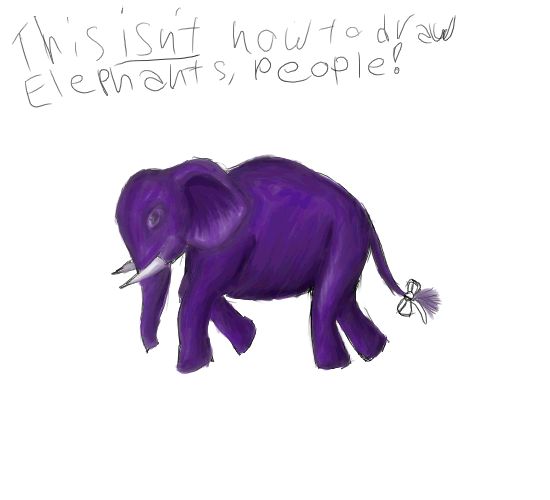
Go crazy! Use lots of soft feathery strokes, and when your colors start to blend nicely, go ahead and grab another color off the picture, light or dark as you please, and blend that in so you can get more light or shadow. Now Derek should be looking a bit more natural on the color blend.
Now, I've decided I'm going to use a lighter color, kind of a soft lilac, for the highlights.

Of course now you'll probably say he looks like he's too shiny. Remember, grab colors from the picture itself and blend, don't be afraid to grab colors from all over, just get messy with it. But remember, don't go against the flow of the object.
With lots of smudging and grabbing colors from all over, feathery strokes make Derek look much more natural. For a purple elephant.
Now grab a new color, I've picked a sort of teal color. We're going to do his eye. Just use a small brush for this, if you're still using that recommended size 3, you should be fine. Work the color up nice and strong, but try not to make the eye too big.
Just use the same blend tricks for the eye and the bow that you used for the rest of him. The main color, soft strokes with some light and dark.

And there you go.
If you want to add a little more depth, get out that pencil tool, put it to black/a really dark color, and just add in a pupil for that eye. Put the pencil at 100% opacity and size 0.5. But if you do that, be sure to go back to your paint brush and blend over it again so the colors meld.

And there. Derek the purple elephant.
The event file for Derek can be downloaded here, if you really want to watch. Of course you'll see some odd things here, like a flower I had doodled before getting the basic requirements for the requested tutorial, and where my hand slipped a couple times on the pad while writing "people." No one's perfect. Exactly the type of thing you have the "undo" button for.

It may take some time to really get used to the feather vs. scribble feel of the brush, or maybe no time at all. Don't get frustrated if it takes longer, giving up will make you feel worse in the long run, just play with your color blends a bit more. Once you do get used to it you can do more interesting things than a single colored elephant.

In closing I leave you all with these words of encouragement.
Nothing is ever perfect. And while practice doesn't make perfect, it does improve. Time and effort can make all the difference if you apply yourself and stay motivated. Nothing is impossible, so don't give up.
"The greater the artist the greater the doubt. Perfect confidence is granted to the less talented as a consolation prize." -- Unknown.
| 
